Use technical language to describe the main features of time series data
Define time series analysis
Define time series
Define sampling interval
Define serial dependence or autocorrelation
Define a time series trend
Define seasonal variation
Define cycle
Differentiate between deterministic and stochastic trends
Plot time series data to visualize trends, seasonal patterns, and potential outliers
Plot a “ts” object
Plot the estimated trend of a time series by computing the mean across one full period
Preparation
Read Sections 1.1-1.4
Learning Journal Exchange (15 min)
Review another student’s journal
What would you add to your learning journal after reading your partner’s?
What would you recommend your partner add to their learning journal?
Sign the Learning Journal review sheet for your peer
Vocabulary and Nomenclature Matching Activity (5 min)
Check Your Understanding
Working with a partner, match the definitions on the left with the terms on the right.
Vocabulary Matching
A figure with time on the horizontal axis and the value of a random variable on the vertical axis
A systematic change in a time series that does not appear to be periodic
Repeated pattern within each year (or any other fixed time period)
Repeated pattern that does not correspond to some fixed natural period
Observations in which values are related to lagged observations of the same variable
Random trend that does not follow a discernible or predictable pattern
Can be modeled with mathematical functions, facilitating the long-term prediction of the behavior
Cycle
Correlated (Serially Dependent) Data
Deterministic Trend
Seasonal Variation
Stochastic Trend
Time Plot
Trend
Comparison of Deterministic and Stochastic Time Series (10 min)
Stochastic Time Series
The following app illustrates a few realizations of a stochastic time series.
If a stochastic time series displays an upward trend, can we conclude that trend will continue in the same direction? Why or why not?
Deterministic Time Series
The figure below illustrates realizations of a deterministic time series. The data fluctuate around a sine curve.
Class Activity: Importing Data and Creating a tsibble Object (5 min)
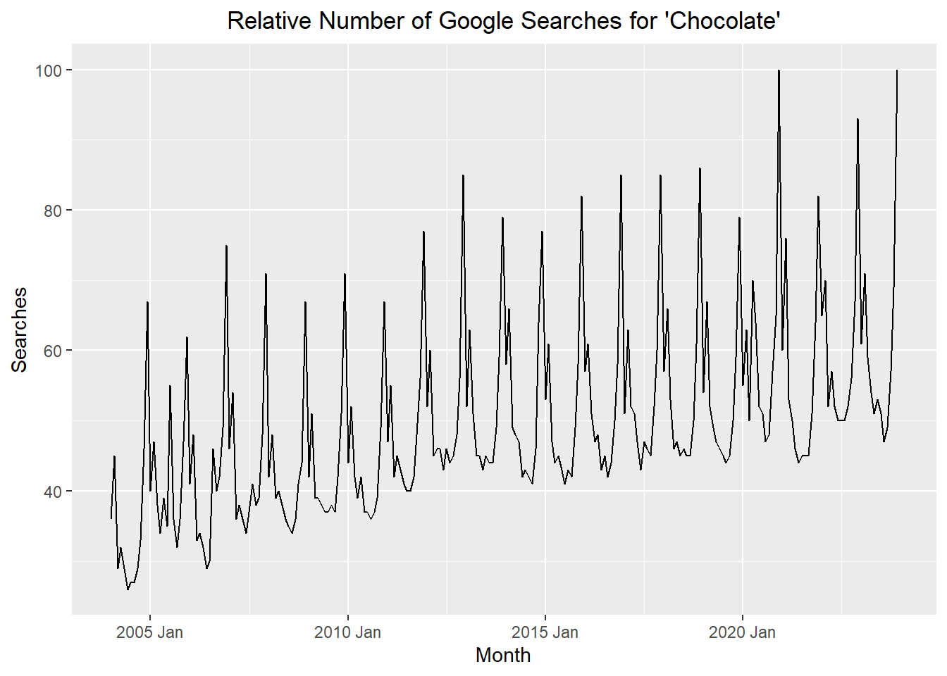
Recall the Google Trends data for the term “chocolate” from the last lesson. The cleaned data are available in the file chocolate.csv. Here are the first few rows of the csv:
Use the code below to import the chocolate data and convert it into a time series (tsibble) object. You can click on the clipboard icon in the upper right-hand corner of the box below to copy the code.
# load packagesif (!require("pacman")) install.packages("pacman")pacman::p_load("tsibble", "fable","feasts", "tsibbledata","fable.prophet", "tidyverse","patchwork", "rio")# read in the data from a csvchocolate_month <- rio::import("https://byuistats.github.io/timeseries/data/chocolate.csv")# define the first date in the time seriesstart_date <- lubridate::ymd("2004-01-01") # create a sequence of dates, one month apart, starting with start_datedate_seq <-seq(start_date, start_date +months(nrow(chocolate_month)-1),by ="1 months")# create a tibble including variables dates, year, month, valuechocolate_tibble <-tibble(dates = date_seq,year = lubridate::year(date_seq), # gets the year part of the datemonth = lubridate::month(date_seq), # gets the monthvalue =pull(chocolate_month, chocolate) # gets the value of the ts )# create a tsibble where the index variable is the year/monthchocolate_month_ts <- chocolate_tibble |>mutate(index = tsibble::yearmonth(dates)) |>as_tsibble(index = index)# generate the ts plotchoc_plot <-autoplot(chocolate_month_ts, .vars = value) +labs(x ="Month",y ="Searches",title ="Relative Number of Google Searches for 'Chocolate'" ) +theme(plot.title =element_text(hjust =0.5))choc_plot
Explore R commands summarizing time series data
Check Your Understanding
What does each of the following R commands give us?
head(chocolate_month_ts, 1)
tail(chocolate_month_ts, 1)
guess_frequency(chocolate_month_ts$index)
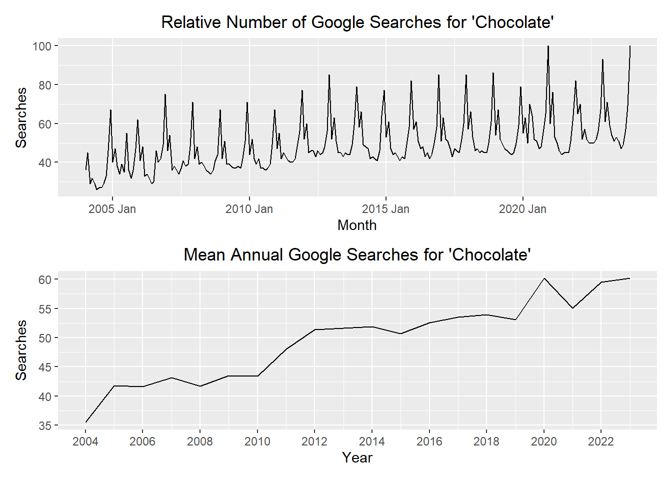
Estimating the Trend: Annual Aggregation (10 min)
To help visualize what is happening with a time series, we can simply aggregate the data in the time series to the annual level by computing the mean of the observations in a given year. This can make it easier to spot a trend.
For the chocolate data, when we average the data for each year, we get:
Aggregation
chocolate_annual_ts <-summarise(index_by(chocolate_month_ts, year), value =mean(value) ) #chocolate_annual_ts
The first plot is the time series plot of the raw data, and the second plot is a time series plot of the annual means.
Show the code
# monthly plotmp <-autoplot(chocolate_month_ts, .vars = value) +labs(x ="Month",y ="Searches",title ="Relative Number of Google Searches for 'Chocolate'" ) +theme(plot.title =element_text(hjust =0.5))# yearly plotyp <-autoplot(chocolate_annual_ts, .vars = value) +labs(x ="Year",y ="Searches",title ="Mean Annual Google Searches for 'Chocolate'" ) +scale_x_continuous(breaks =seq(2004, max(chocolate_month_ts$year), by =2)) +theme(plot.title =element_text(hjust =0.5))mp / yp
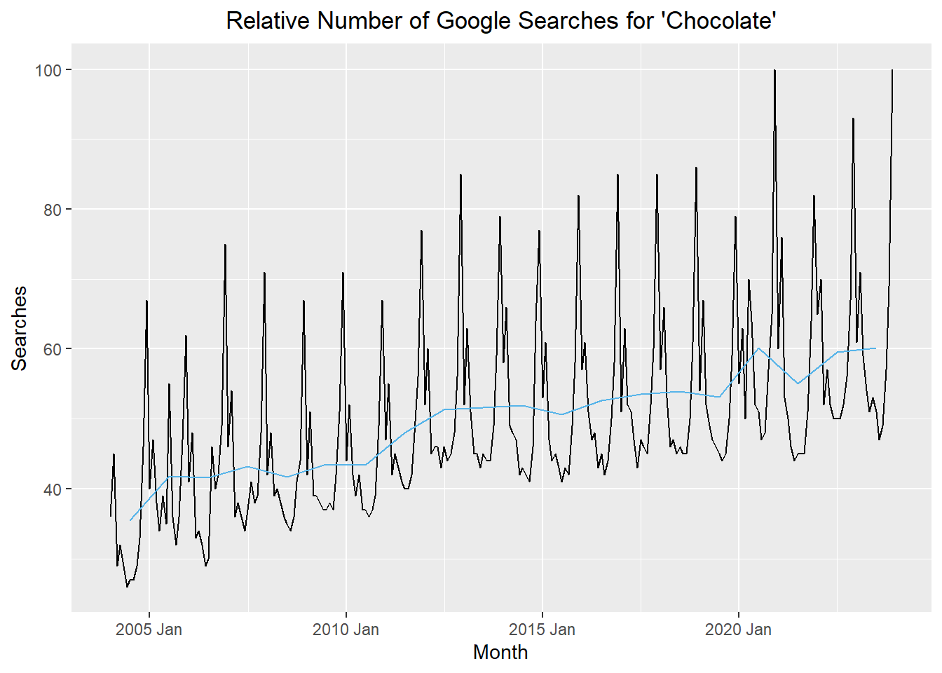
If you want to superimpose these plots, it would make sense to align the mean value for the year with the middle of the year. Here is a plot superimposing the annual mean aligned with July 1 (in blue) on the values of the time series (in black).
Show the code
chocolate_annual_ts <-summarise(index_by(chocolate_month_ts, year), value =mean(value) ) |>mutate(index = tsibble::yearmonth( mdy(paste0("7/1/",year)) )) |>as_tsibble(index = index)# combined plotautoplot(chocolate_month_ts, .vars = value) +geom_line(data = chocolate_annual_ts, aes(x = index, y = value), color ="#56B4E9") +labs(x ="Month",y ="Searches",title ="Relative Number of Google Searches for 'Chocolate'" ) +theme(plot.title =element_text(hjust =0.5))
Check Your Understanding
What do the annually-aggregated data tell us about the trend?